
PIZZAHUT HK
UXUI re-design | Mobile app
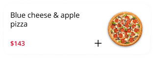
Preview of Final product
Overview
Pizza Hut initiated a comprehensive mobile app redesign project, focusing on enhancing the membership platform and ordering system. The primary objective of this project was to revitalise the brand image, foster stronger customer loyalty, and optimise the overall ordering experience for their customers.Roles
UX/UI designer
Wireframe, Prototyping and testing, Visual design, Coding (Html / Scss), Interaction
Final Product - Website
This design strategically focuses on capturing the attention of the younger demographic, effectively strengthening the brand's identity.


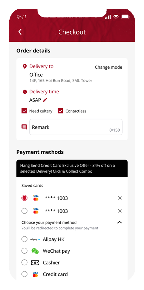
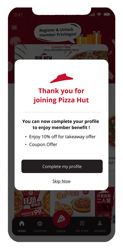
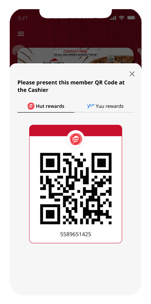
Final Product - Mobile Application


Let’s check the process below
Part 1. Analysis
ORIGINAL APP DESIGN

Flowchart for THE original app

1. The presentation of member and reward information lacks organisation and fails to command attention.2. The member-related features lack clear guide and direction for users.3. The feature’s lack of variation and engagement contributes to a low level of usability within the app4. The visual design exhibits significant usability and accessibility issues.Understanding the problem
OUR TARGETS
Part 2. Define Goals
Learning
At the stage of creating flow chart, it is essential to clarify how different pages interact and address across various devices.
The original flow chart was unclear, causing confusion among the engineers during development.
To ensure the project's timely completion, the UX consultant and I reviewed and fixed all the concerns, ensuring the addressing and flows are accurate and ready to develop.
Flowchart for the redesignED APP

1. Prioritise and streamline the ordering features to enhance user experience.2. Emphasise the significance of ordering and loyalty programme as the core features of the app3. Consolidate the member-related features into a dedicated page4. Enhance usability and accessibility to ensure a seamless and inclusive user experience.5. Design user-friendly elements for registration processes to encourage user register to a member6. Provide clear guideline on utilising and redeeming rewards to the better user experienceRevised approach for a similar situation
I recognise that it was not the correct way to create a user flow. After completing a course on Coursera about UX design titled "Build Wireframes and Low-Fidelity Prototypes," I have learned the proper way to outline a user flow and have understood that different shapes hold common meanings when outlining a user flow. I believe that I will do much better if given another opportunity.
Screen captured via Coursera
Revised user flow


WIREFRAMING
Part 3. Wireframing

Protoyping in Figma
Flow - Check my previous order
Flow - Ordering food (Guest)
Flow - Check membership page
DESIGN
Part 4. Design
Learning
At the stage of visual design, I presented to clients with a selection of at least 3 different styles that aligned with their brand identity. However, the satisfaction wasn't fully met.
Therefore I proactively modified the design option again and again, finally met the satisfaction!

Usually, before starting the visual design, I would create several mockup screens based on the requirements and brand identity, However this approach often resulted in extensive modification and redesign efforts.
I understood visual design is subjective in nature. Reflecting to this experience, utilising components as a guideline for the desired look and feel can streamline future modifications. Therefore, I would like to prioritise research and development of components before creating mock-up screens.
Style1

Style2

Style3
From version 1 to version 5 (final VERSION)

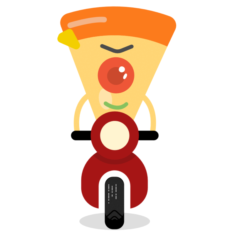
Character design / Pizza-jai


This was the first version of Pizza-jai I created.

I used a combination of bright and gentle color tones. These colors are meant to evoke feelings of energy and fun. In particular, I incorporated appetising colors like orange and yellow.

I also aimed to convey a sense of liveliness through Pizza-jai. Through his expression and pose, I included elements that express fun and excitement, to emphasise that eating pizza is a joyful event.

The client commented that it was cute, but also pointed out that the concept felt a bit weak.
When reconsidering the concept
I researched actual posters and advertisements from Pizza Hut to understand their messaging and how they are evaluated.

They are selling to share joy to your family and friends, and get fun in the party with eating pizza.


Emphasises the joy of sharing with friends and family.
This is the concept I decided.
In the end, I decided on a concept that emphasizes the joy of sharing with friends and family.
 After putting in quite a bit of effort, I created this new version of Pizza-chan.
Compared to the previous design, the face is now easier to distinguish, and the pose has been made more flexible.
As for the pose, I was able to incorporate movements that convey a sense of fun, excitement, and energy."

Animation
I created three animations using CSS.
You might ask why I didn’t use After Effects — the reason is that using CSS allows for smaller file sizes, which makes the animations run smoothly even on mobile devices and improves the user experience. In this way, I prioritized performance as a key factor and chose to use CSS-based animation techniques.
Greetings

With no content
Loading…
Since the animations cannot accurately demonstrate their performance here, I would like to present an example how they are implemented in the actual application.FINAL DESIGN
TYPOGRAPHY

Color
Components


Final Product - Mobile Application
Final Product - Website
CONCLUSION
Part 5. Reflect
This project marked my first experience handling all aspects independently, from research and wireframing to prototyping, creating mock-ups, and collaborating with engineers to bring the design to life. We faced the challenge of delivering the project within a few months. It was a big challenges but I found great excitement in taking on this responsibility.

Prior to the sign-up phrase, we got several meetings with clients to go through and understand their needs and expectations. Effective communication was the best thing we did, involving stakeholders such as clients, sales, project managers, product directors, designers and also engineers. We always consult with each other before making decision. It would not happen without anybody during the tight deadline.

Not being an expert of front-end logic, I encountered confusion and felt lost when addressing interactions across different pages and devices. It was the engineer who brought this issue to my attention, so I seek the assistance of a UX consultant. Together, we worked tirelessly day and night to resolve the challenges. I was grateful about their understanding and patience.

However, if given another opportunity, I would dedicate more effort to research and A/B testing. Looking back, I realise that we did not conduct sufficient research during this project. I would send users survey to gather feedback on the current app's user experience, to identify what user exactly needs and pain points. Additionally, I would conduct thorough A/B testing for each idea and flow, ensuring we achieve a usable and exceptional user experience.
DESIGN SYSTEM
A new design system for an ordering experience, with "CONSISTENT" and "FLEXIBLE".
TEXAS CHICKEN
Two fun mini-games that encourage customers to check in daily, allowing them to earn rewards as they play.
The Rink
A website for one of the best ice rink in Hong Kong.
PIXAL ART
A ordering pages for Hong Kong’s traditional noodles, with pixal art design.
MAHJONG APP
(In progress)
Case Study: Optimizing application performance with new analysis feature.