Design System
A new design system(responsive) for an ordering experience.
Preview of Final product
Overview
As our company experiences rapid growth from different country, there arises a need for a design system. This system allow us to maintain consistency and efficiency by providing comprehensive design guidelines, it also can be easily tailored to different clients through a few clicks and adjustments, ensuring "CONSISTENT" and "FLEXIBLE". We have created the tokens library and components library that streamline communication with developers through Github, acting as a bridge over design team and frond-end team.
Additionally, we established standard flow for mobile food ordering to guarantee the consistency and quality from the design teams.
Roles
Product designer
Create tokens library; Create components library; Provide complete ordering flow that using tokens and components Platform
Figma, Token Studios, NotionFinal Product - Website
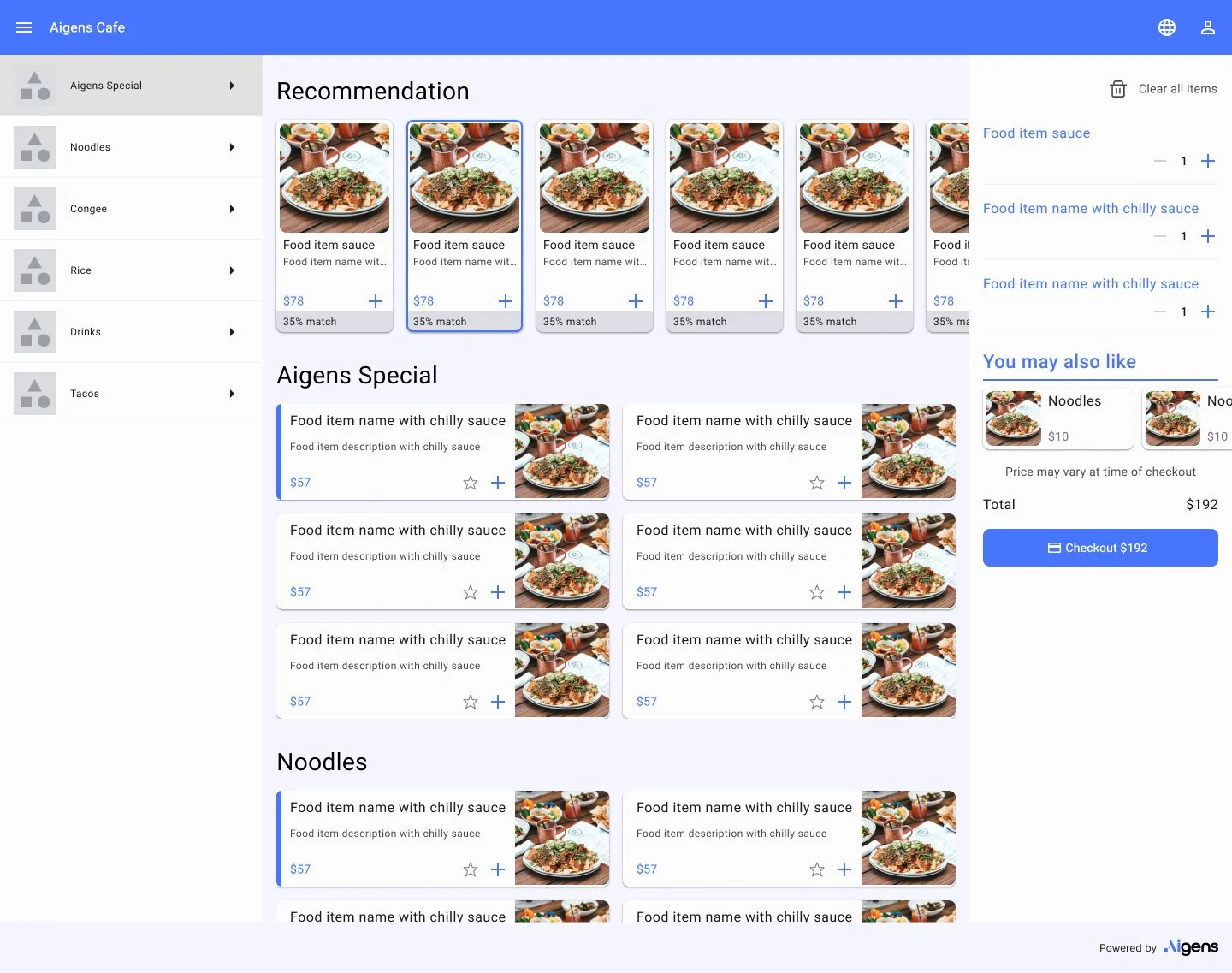
Final Product - Mobile


Let’s check the process below
GRID SYSTEM
Part 1. Foundation
Desktop : Column 12; Margin 120px; Gutter 16px; Max width 1200px
Tablet: Column 8; Margin 32px; Gutter 16px
Mobile: Column 4; Margin 16px; Gutter 16px

Desktop
Tablet
MobileTypography
Typography is a key part of the design system. It helps establish hierarchy and communicate important content by creating clear visual patterns.
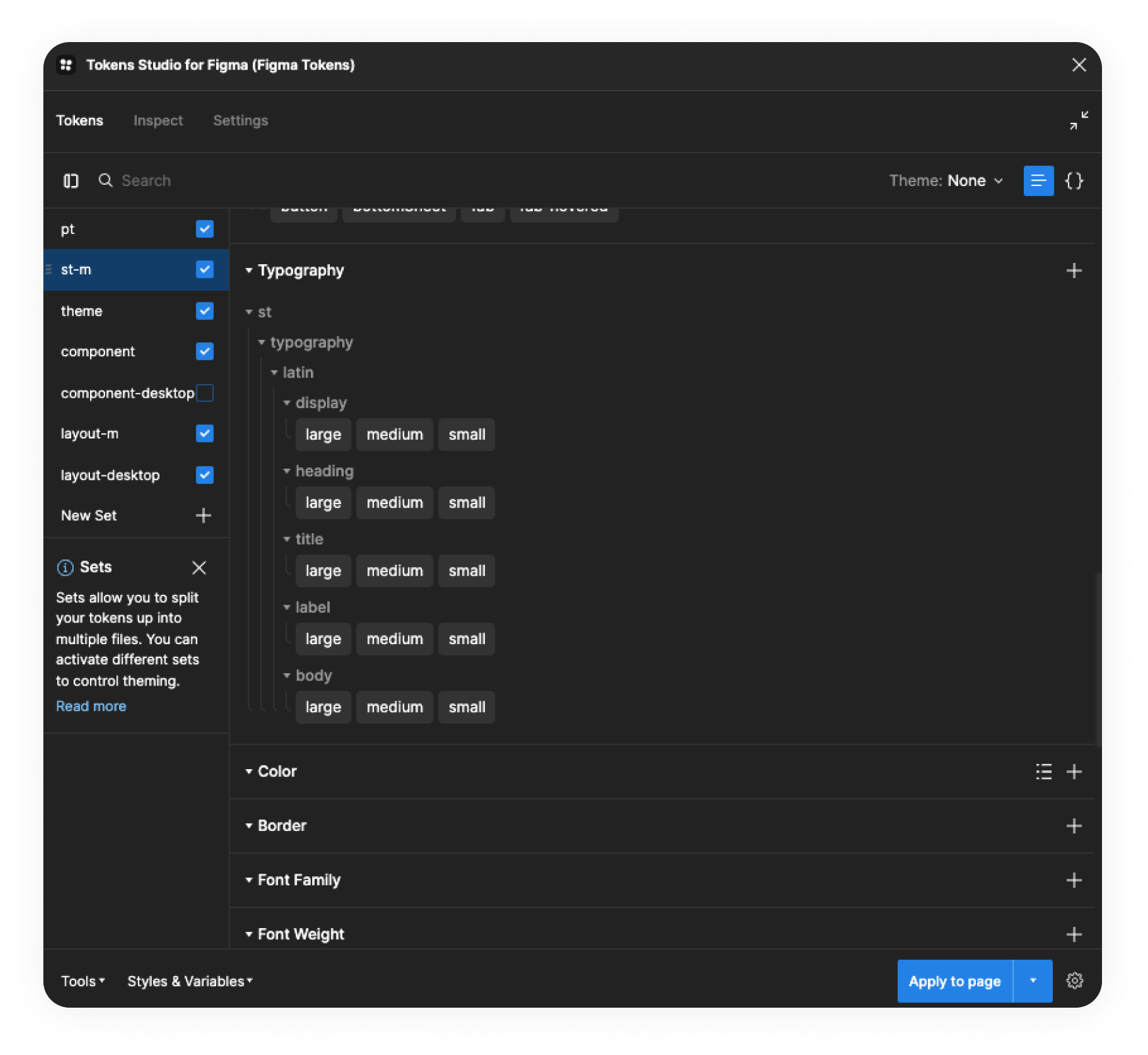
Create a set of system tokens for typography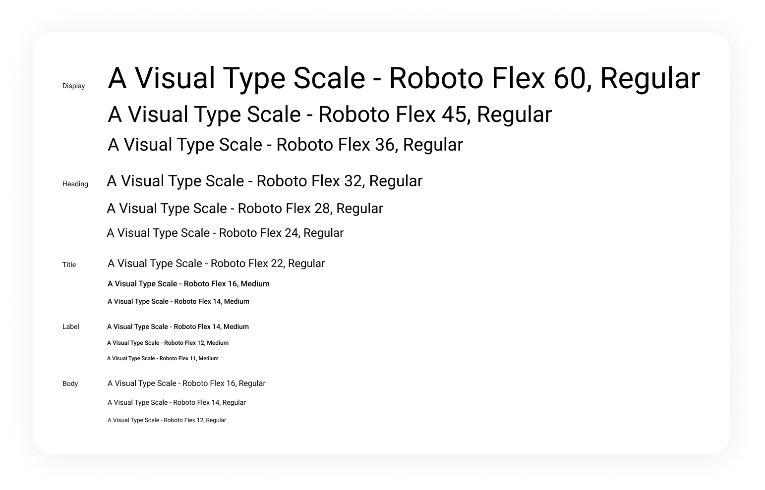
ICONGRAPHIC
In the Aigens Design System, the icons are designed to be generic, allow them to be applied to different brands. We have created both outlined and filled styles, making it easy to switch between them as needed.
Color palette
In the Aigens Design System, the primary, secondary, and tertiary colors are designed to be easily customizable based on the brand identity and client requirements. All components and mockup screens are already applied with color tokens, allowing us to effortlessly change the theme colors with just a few clicks.

Create a set of system token for colors, that can easily change the theme colors as needed 
Color palette with different uses
Applications
Dimension
It establishes the foundational value set in primitive tokens for use in sizing and spacing.
Learning
The foundation is a crucial element as it determines the system's usability and flexibility. Getting started was challenging as we needed to identify all the relationships and patterns between values. We extensively researched design systems such as Material Design, Ant Design, and others for reference, analysing the differences and potential causes.

Adding value to Figma tokens was an interesting task, but it required utmost caution as it was easy to make mistakes and end up with a messy outcome. Despite the challenges, we thoroughly enjoyed the process.
COMPONENTS
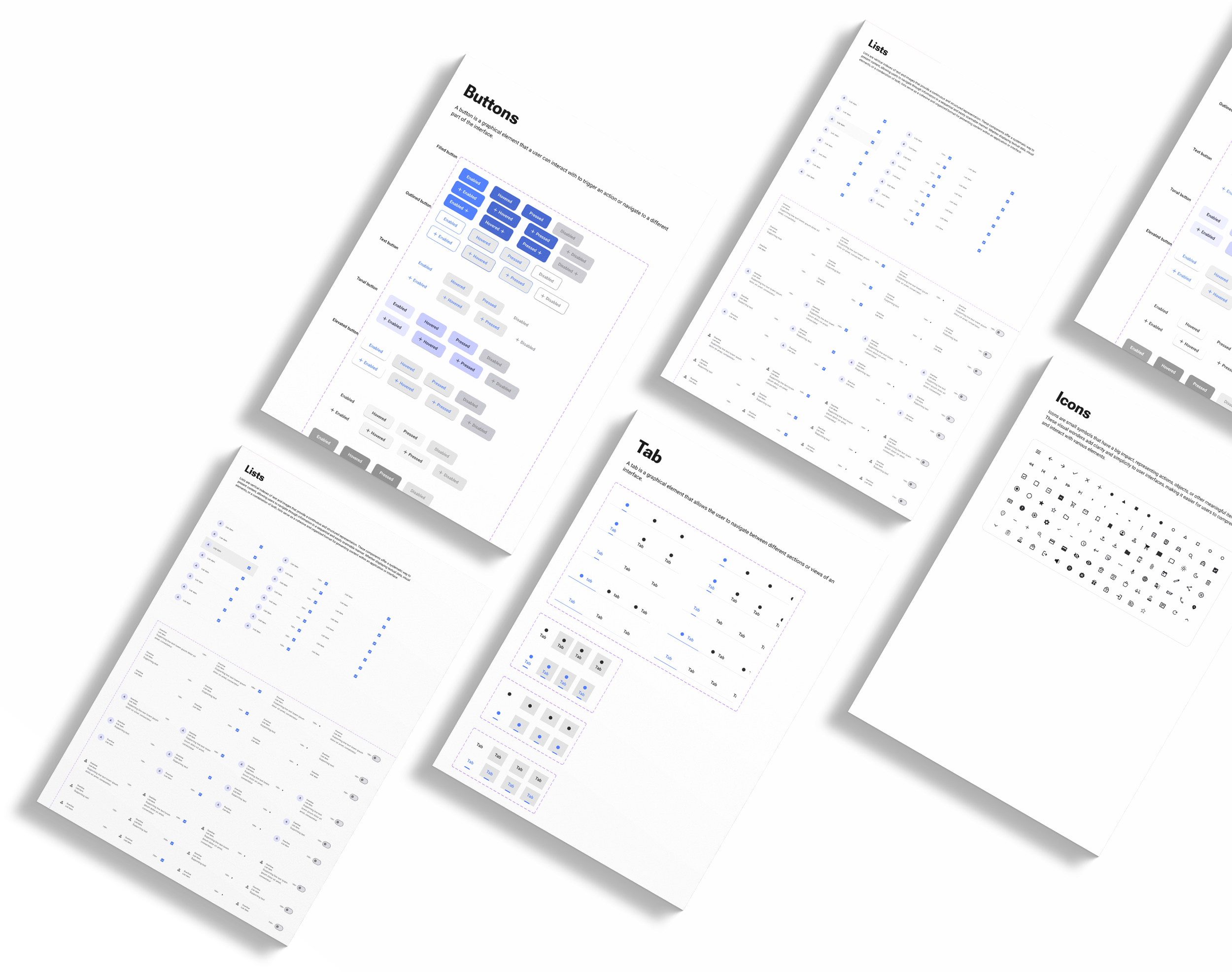
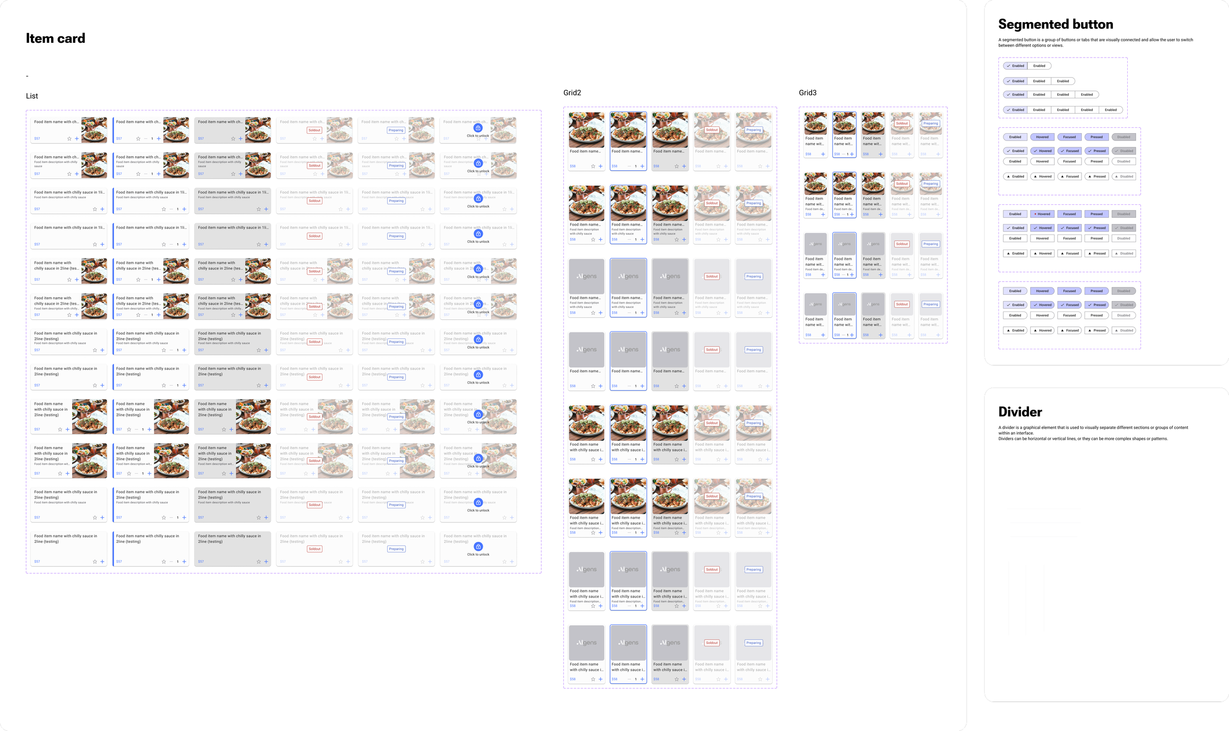
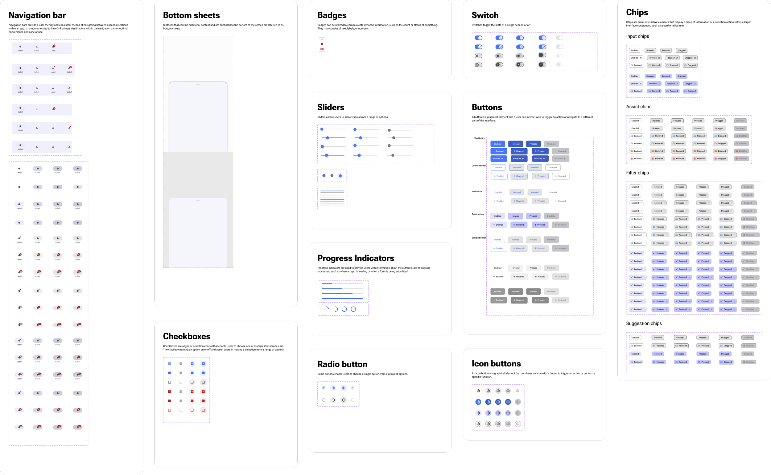
Part 2. Components
We have created components with tokens in Figma, which is allowing for drag and drop in mock up screen. These components can be easily tailored in just a few clicks. It’s highly adaptable that offering different types (selected, error, etc), states (enabled, disabled, etc) and the option to show or hide icons, based on specific needs.
Example of the component switch to different style
Text fieldsItem card - list view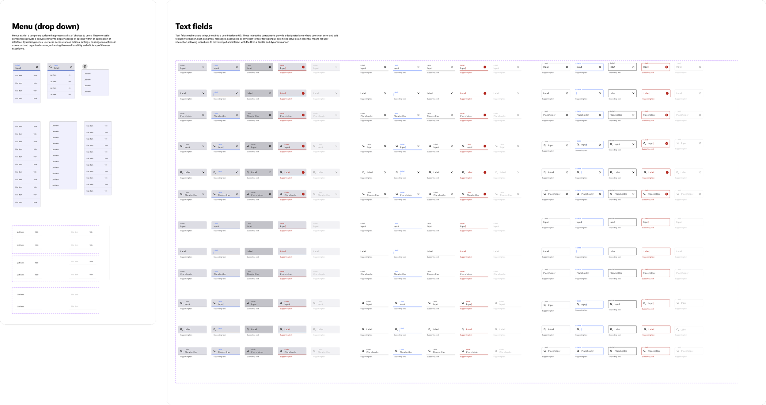
Overview of all components

Learning
Creating components with tokens has been the most enjoyable part in this project. Each time a component successfully worked, I couldn't help but feel excited. I've learned the art of crafting different variants, properties, and boolean options, all encapsulated within one elements. I have also experienced a shift in my mind for creation, it's much logical and valuable than before.

In the beginning, I invested many time for studying various approaches to component creation. Unfortunately, this led to the creation of several components that were not usable at that stage, or some token are missing. However, the process became smoother and the quality improved.

Aside from considering the type of components, ensuring their usability for every designer is equally important. I consistently ask myself, "What is the most easily applicable way for everyone?" when creating new components. My goal is to provide a great experience for designers, so that they are willing to embrace and utilise these components in their future work.
MOCK UP
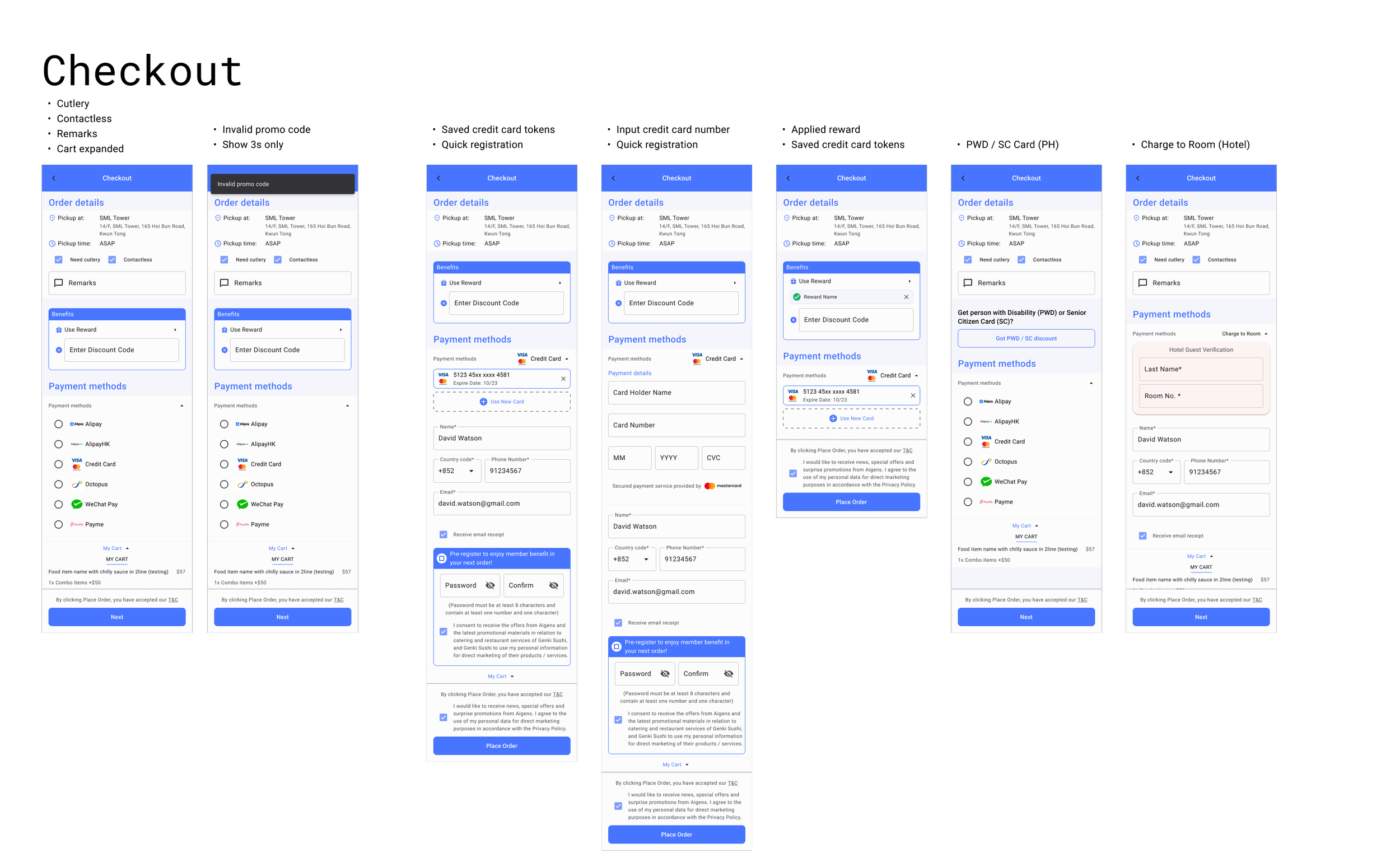
The mockup screens are specifically designed to utilize the components through a drag and drop function. Once implemented, this allows design teams to quickly provide a standardized flow to new clients, ensuring consistency across different clients.
Part 3. Mock up
Additionally, all elements within the screens are already applied with tokens to ensure consistent styles such as font size, spacing, border radius, and more across different screens.

High-Fidelity Mock-Up
-
![]()
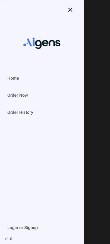
Login with email address
-
![]()
Input email address
-
![]()
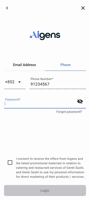
Login with phone - input password
-
![]()
Register - Input OTP
-
![]()
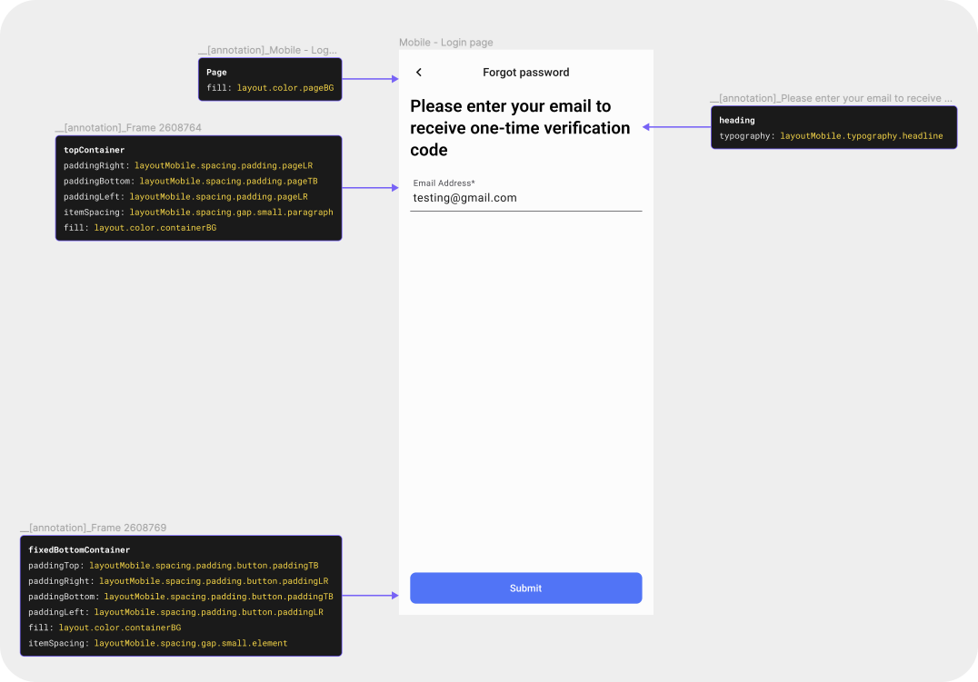
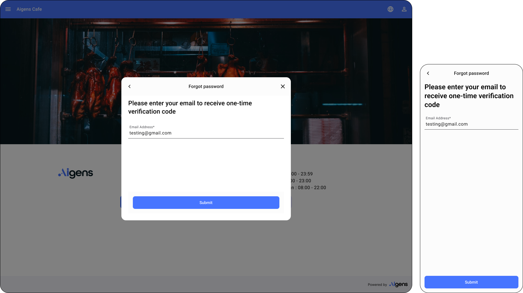
Forgot password


-
![]()
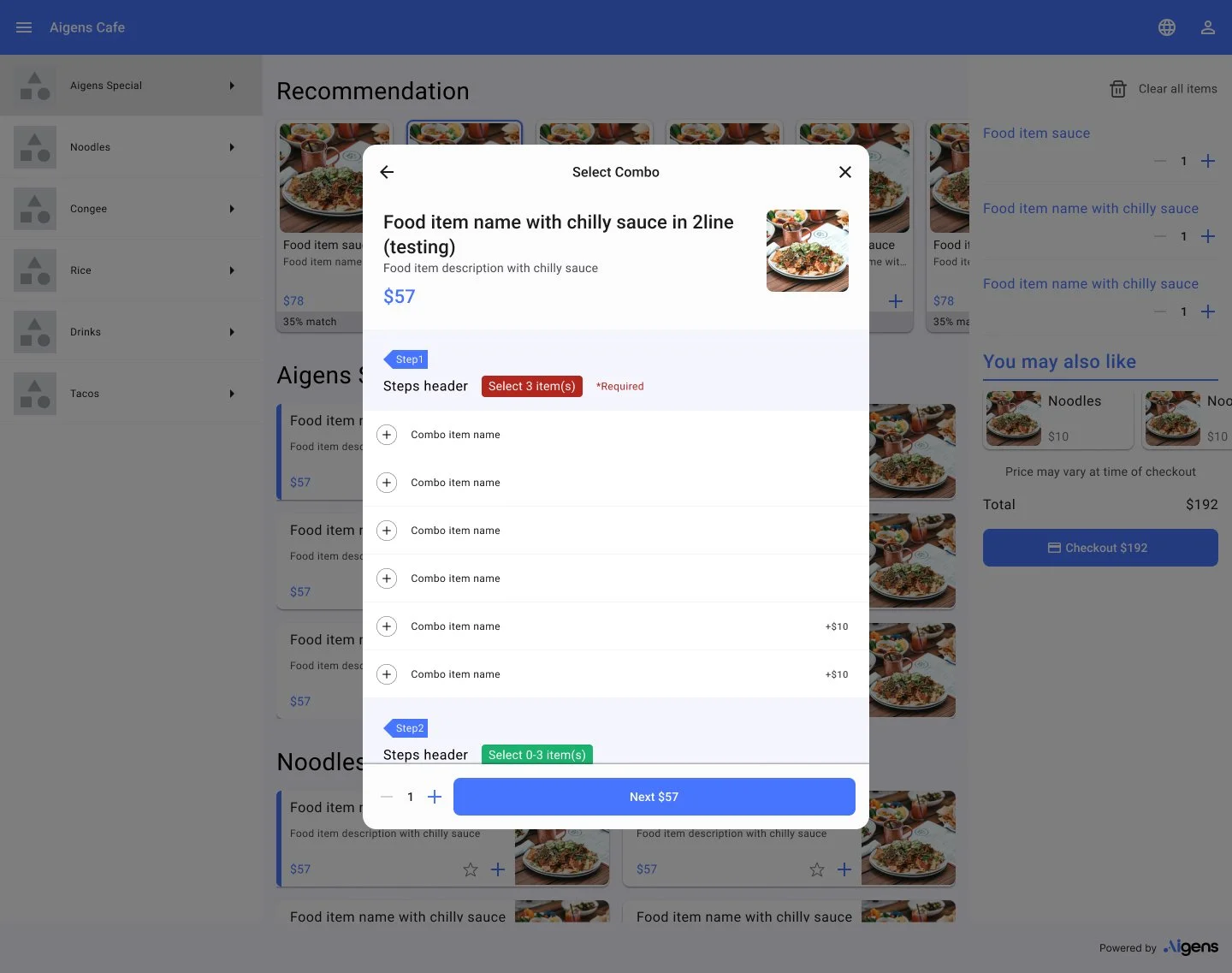
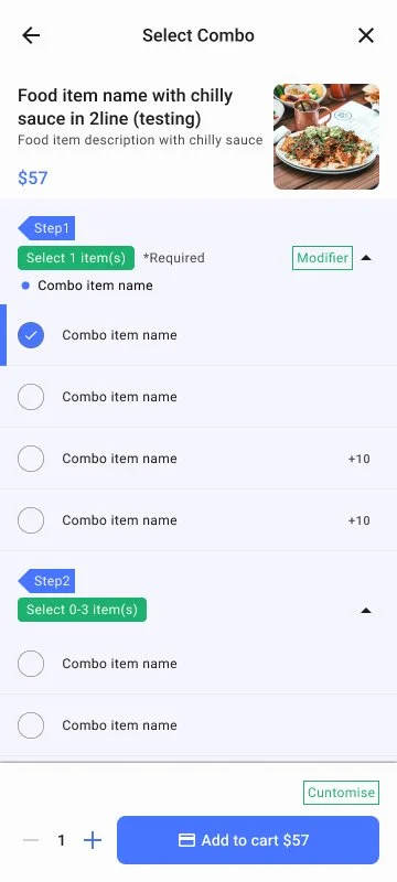
Combo (unselected)
-
![]()
Combo - Selected
-
![]()
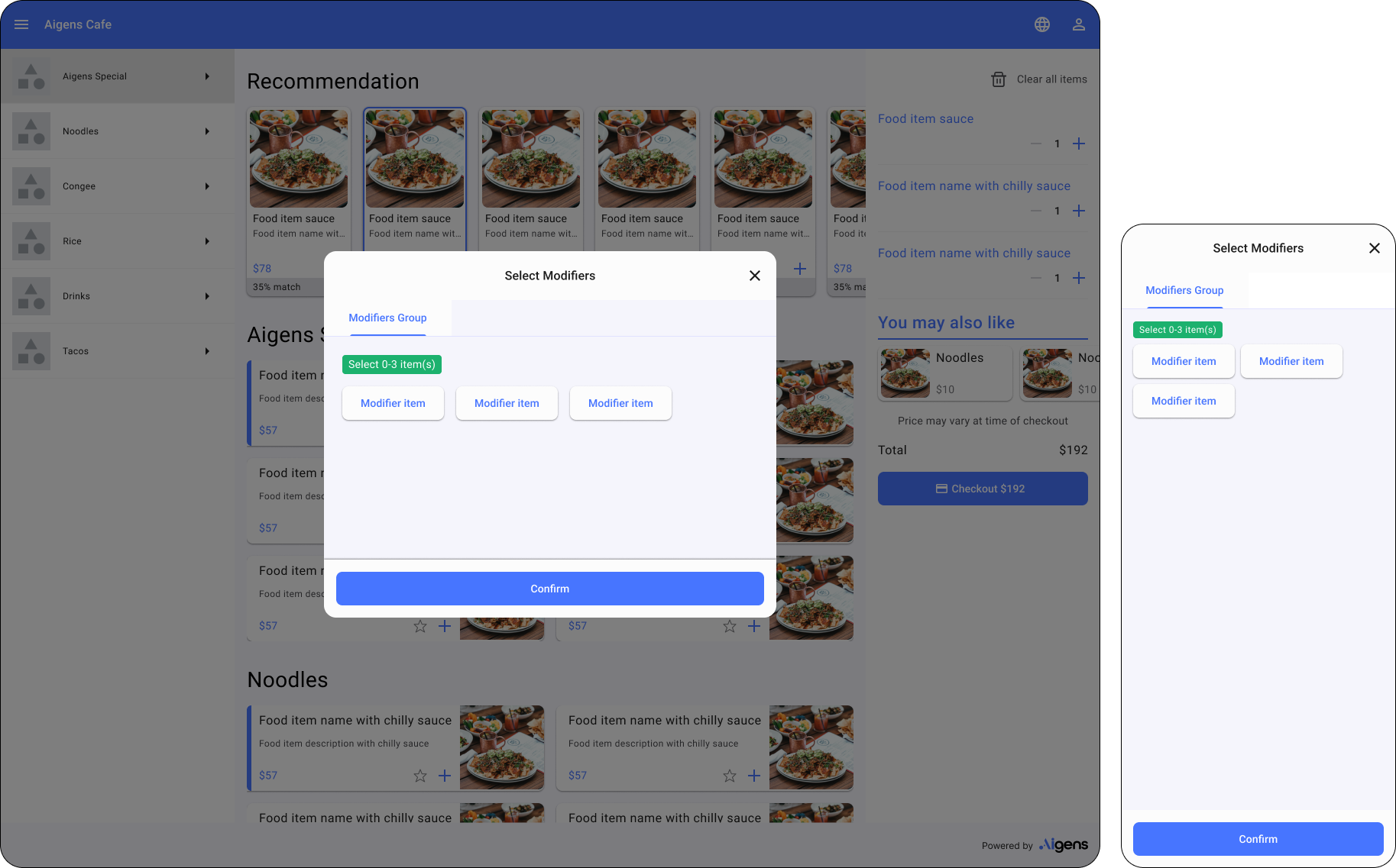
Modifiers
-
![]()
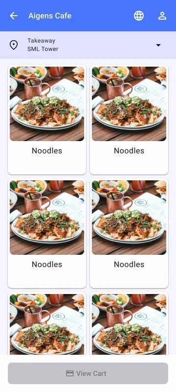
Ordering Menu
-
![]()
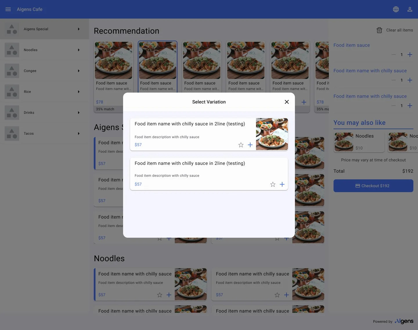
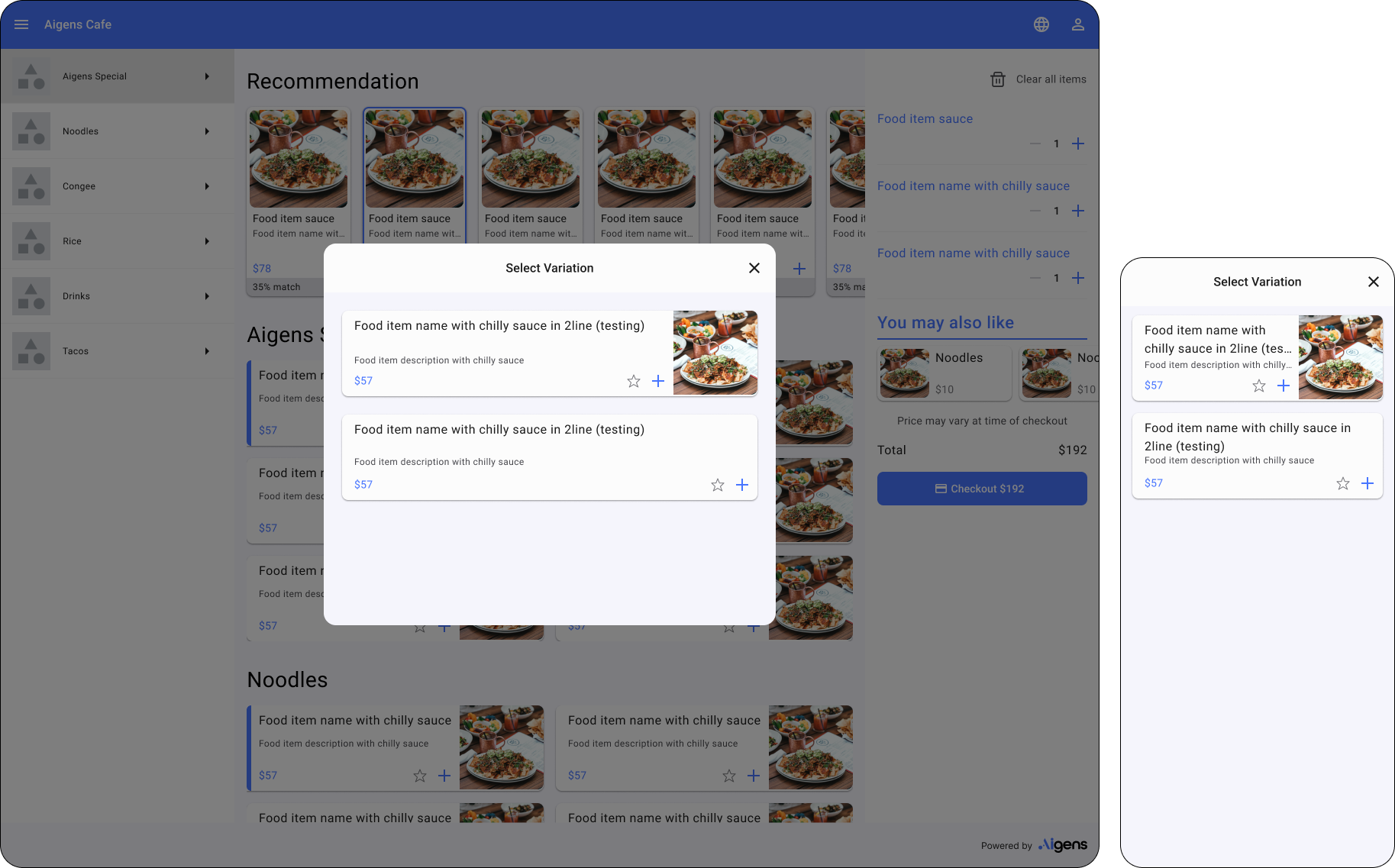
Variation


-
![]()
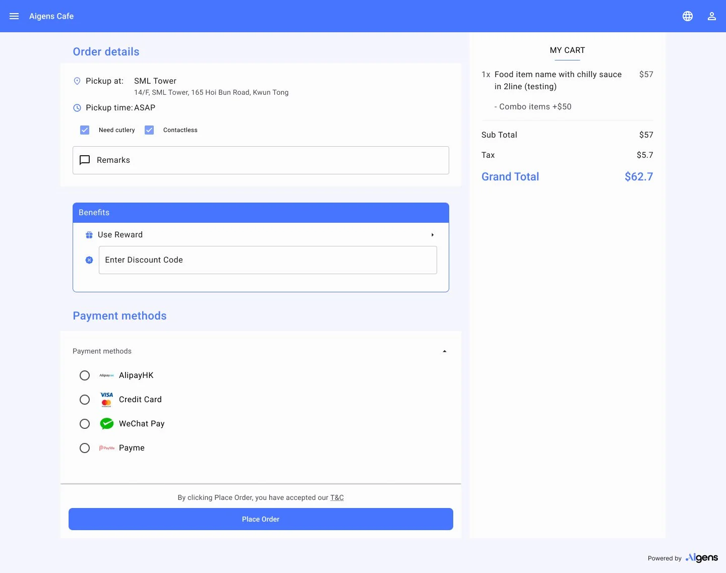
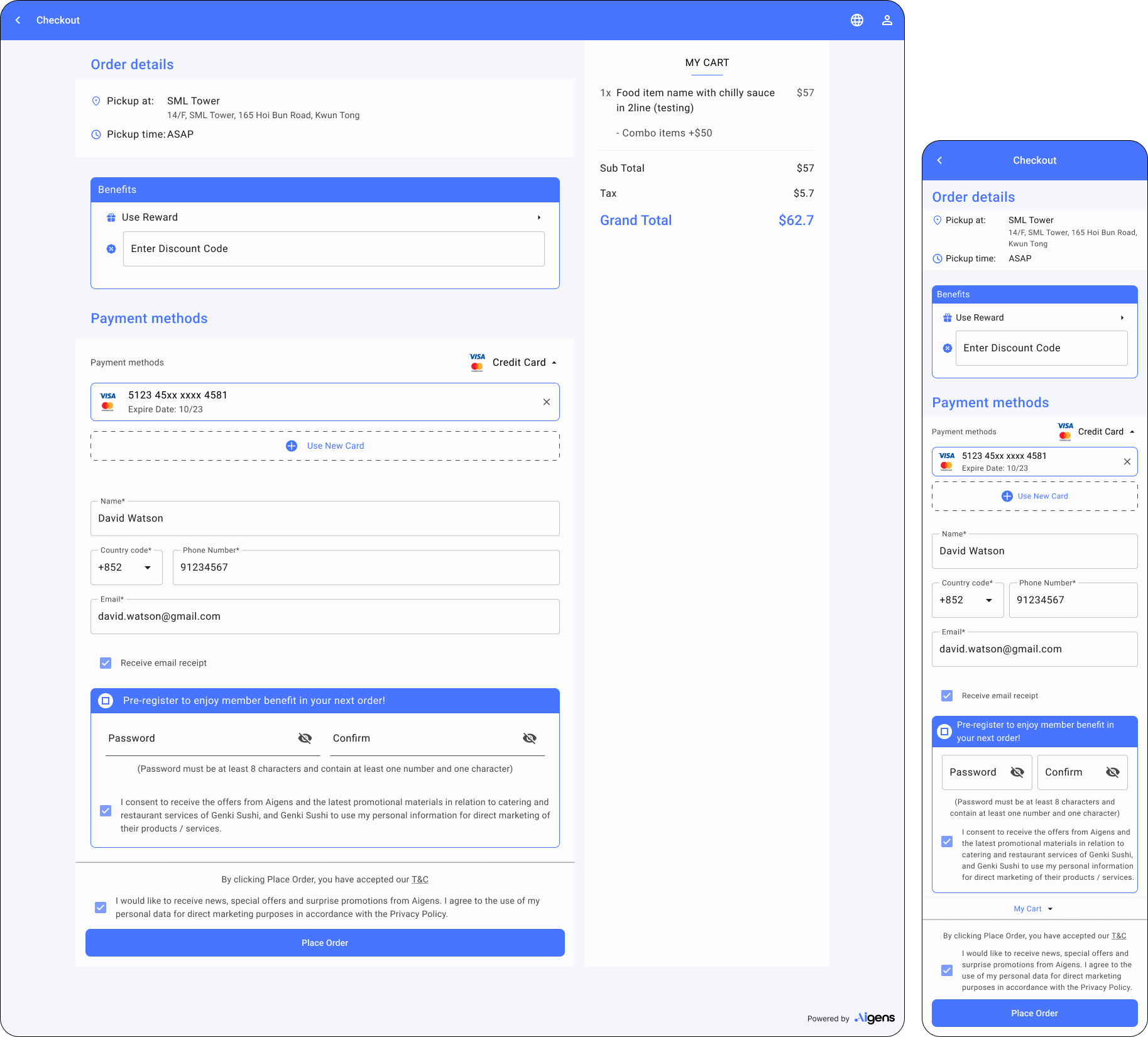
Checkout
-
![]()
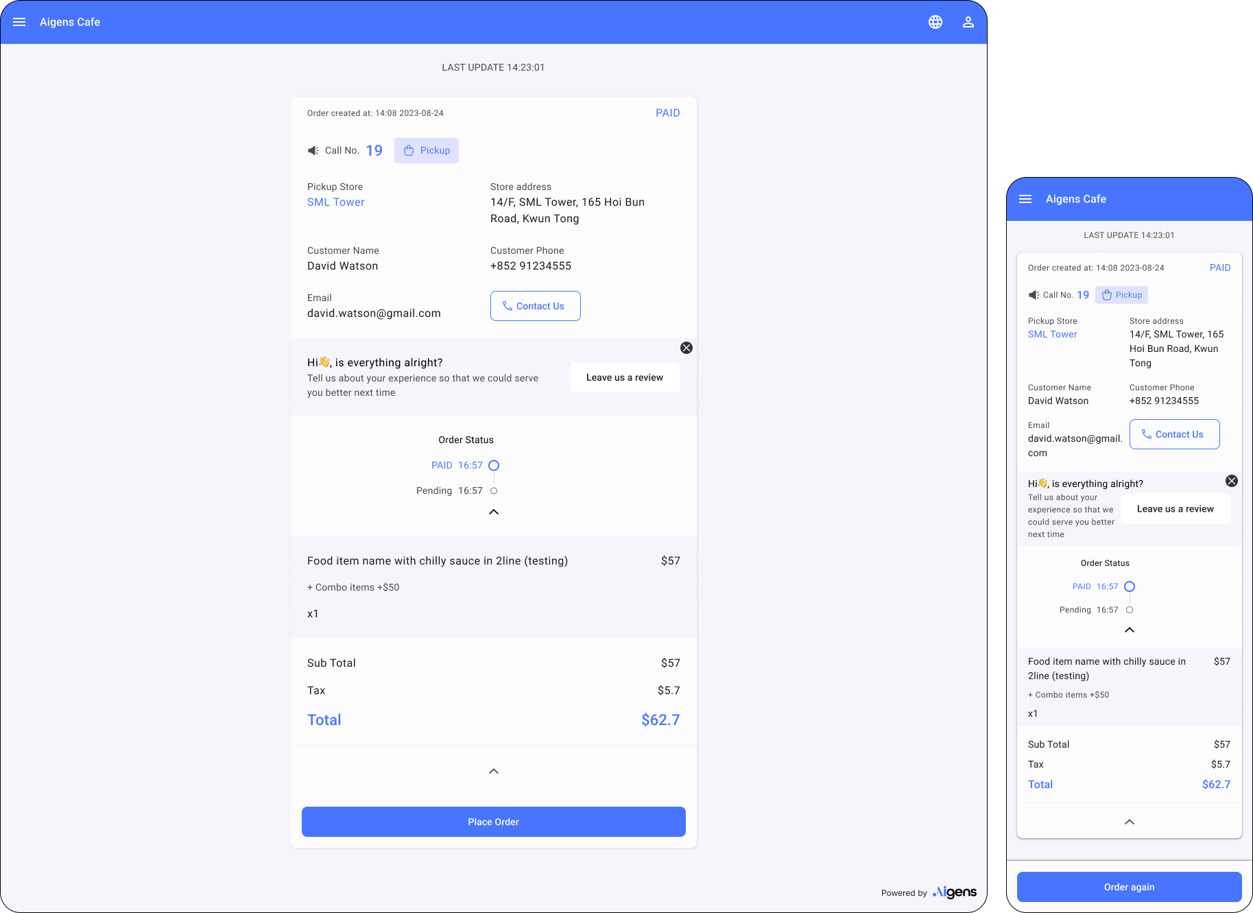
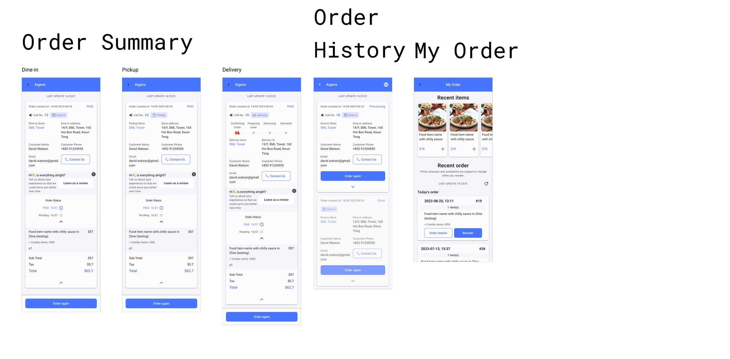
My order
-
![]()
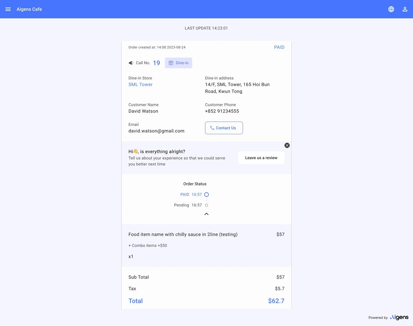
Order details
-
![]()
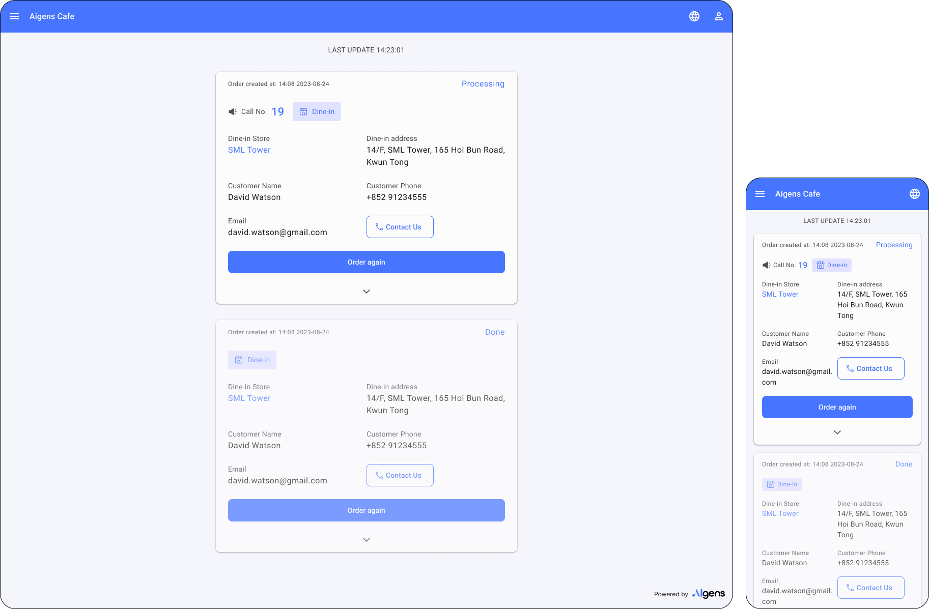
Order History


Overview of all mock up screen


CONCLUSION
Part 4. Reflect
It was an awesome project, and I consider it was one of my proudest achievements. Being involved in such a significant project within the company was truly a privilege. I encountered numerous 'first-time' experiences here, including working with components, tokens, and design systems, which have left unforgettable memories.

However, at the beginning, I doubted my ability to handle this role without a mentor, especially since my manager had left the company, leaving the project in my hands. I had limited knowledge about how tokens worked at that stage. Determined to succeed, I dedicated several days to studying my manager's work, familiarising myself with each token, component, and page. I watched tutorials on YouTube, conducted numerous experiments on my own, and ask for guidance from engineers. Additionally, I discovered a faster way to understand the system—by naming each token based on its associated component. This naming list could be reused during the development stage, which proved to be a valuable idea.

Tokens revolutionised my thinking, making it more logical and valuable. It provided a set of rules governing the relationships between values. We had to apply tokens for every aspect, such as spacing, sizing, and radius. This approach ensured the consistency of the design system, while maintaining the flexibility to fit for different clients' needs.

To me, a design system is a harmonious combination of rules and creativity, consistency and flexibility, efficiency and usability. I am eager to explore further and embrace similar challenges in the future.
PIZZA HUT
A mobile app provides membership and ordering platform to customers.
TEXAS CHICKEN
Two fun mini-games that encourage customers to check in daily, allowing them to earn rewards as they play.
The rink
A website for one of the best ice rink in Hong Kong.
PIXAL ART
A ordering pages for Hong Kong’s traditional noodles, with pixal art design.
MAHJONG APP
(In progress)
Case Study: Optimizing application performance with new analysis feature.